Concrete Beam Reinforcement Designer
Redesigning an engineering web tool for usability and visual appeal.
The Challenge
Many engineers seek design tools to automate the process of design. These tools typically come in the form of expensive software packages, or are created by the engineers themselves in Microsoft Excel. Partnering with developer and fellow structural engineer Fred Lavoie, we have set out to create a set of web-based structural design tools, the first of which designs the flexural steel reinforcing for reinforced concrete beams.
The Approach
User Testing
As the developer already had a working mockup, user testing was conducted with practicing structural engineers on the existing interface.
The users identified several issues with the existing interface and workflow which included:
No identification of what design code was being used,
No inclusion of the design formulas being used,
Uncertainty surrounding the output section prior to use of the calculator,
Confusion about the position of the “help” text,
Uncertainty of the tool’s context, as there is no link to the developer’s page,
Etc…
Competitive Audit
While user testing was on-going, a competitive audit was conducted. Information was gathered for how other engineering web tools were handling user workflows, functionality, outputs, and aesthetics.
With the existing web tools on the market being strongly reminiscent of traditional self-made Excel spreadsheets, the audit identified an opportunity to provide users with a modern and user friendly alternative.
Sketching
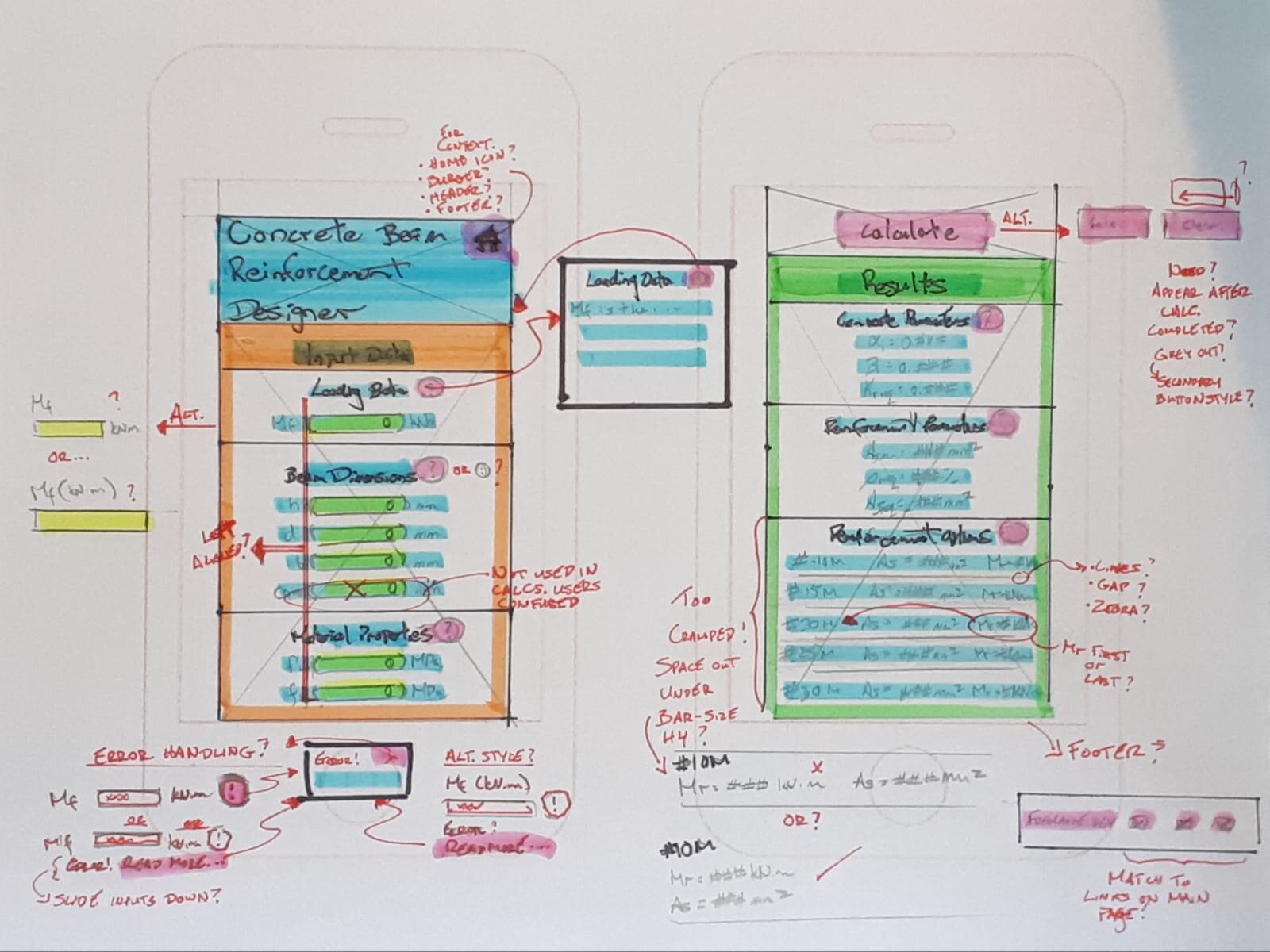
Sketches were made to quickly mock up the overall tool. Options for overall layout and alternatives for addressing issues identified in user testing were explored. A mobile-first approach was taken to ensure that the tool was as conceptually functional as possible with the greatest real estate constraints in place.
Old Aesthetic
One point that was raised by users was that the interface was “very plain,” which, as a result, did not “instill confidence.” This feedback motivated a redesign of the tool’s aesthetic.
New Aesthetic
I wanted to convey a number of things immediately upon arrival:
This is a design tool that utilizes Canadian design codes,
This design tool respects the seriousness of the matter of structural design, and
This design tool is modern and up to date.
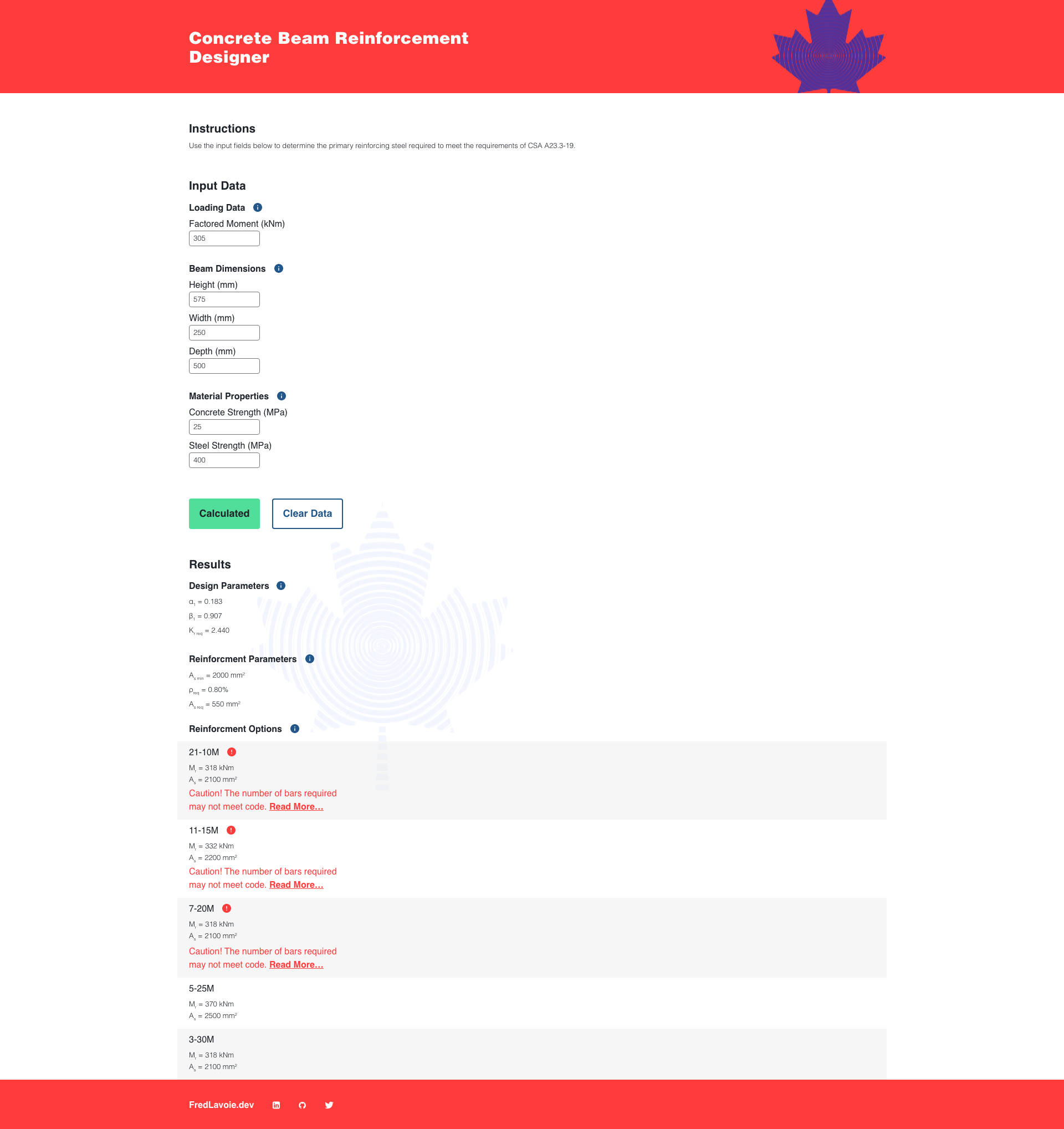
I drew inspiration from the government of Canada’s publications from the 1960’s and 1970’s, a period in which modernism was at the heart of Canadian graphic design. The intent is to connect with older users and convey a sense of familiarity while also highlighting that this tool is for Canadian users. A brighter colour palette than those used in the past was used to modernize the visual appeal.
Help Modals
To address the user issue of the explanatory text residing at the end of the page, information icons were added to section headers and linked to modals with detailed explanatory information and diagrams. Placing additional information directly beside the related fields had the benefit of both streamlinging the workflow and reducing the amount of text on the page.
User Error Handling
Originally, the web tool would return “NaN” in all of the output fields when a user input error occurred. This left user’s confused and unsure what had happened. This was resolved with the addition of error identification and explanations.
Results Focused
In its original form, the web tool displayed solution and output fields as prominently as the input and help text. The only visual cue that there was something unique about this text was that the output fields were coloured a dark blue and filled with zeros. The dark blue offered little contrast between itself and the black text. Users were initially confused at what the text was for and assumed it would become clear once they completed filling out the input fields.
To help indicate to the user that the output fields would be made available after completing the form, they now begin greyed out, and appear as normal body copy once the form is completed.
Error Reduction
The calculate button was updated to change from a blue “Calculate” to a green “Calculated” once the reinforcement design was completed. This state change was reversed if a change occurs to any of the input fields, giving the user confidence that the design output matches the input above.
Additionally, a “Clear Data” button was added to improve user workflow when checking the reinforcement options for multiple concrete beams with different dimensions.
Final Design
Once the ideas for the redesign were fleshed out, the final high resolution version was wireframed.
The Solution
The end product was a beautiful and functional design tool ready for structural engineers to implement in the design of reinforced concrete beams. The redesign enhanced the visual appeal of the tool, conveys critical information to the user, provides users with enhanced error identification, reduces the probability of user errors, and improves user workflow.


